Anna Atiagina
Senior UX Designer specializing in AI and intelligent enterprise tools.

Green Lake Park, Seattle
Green Lake Park is on the oldest and most beloved Seattle parks. It was built as a part of 1903 Olmsted plan, and became famous for its boathouse, beach, bathhouse, trails, tennis courts and baseball fields. In the 1960’s The Green Lake Aqua Theater held concerts of such bands as The Grateful Dead and Led Zeppelin.
As one of the exercises for the SCCA Wayfinding Design class, we were asked to redesign the existing signage and murals in the park. I was inspired by the modern urban culture, and wanted to give the park a more modern look. The main goal of the project was to create a distinctive look for Green Lake Park.
Target Audience: Seattle Residents of all ages.
Deliverables:
a set of 14 icons;
orientation sign: map of Greenlake;
regulatory sign: park rules;
monument sign: history of Greenlake;
directional sign: Lane signage Feet/Wheels -freestanding sign and ground;
regulatory sign: Leash Pets / Obey Scoop Law;
regulatory sign: Open Water Swimming;
mural for Aqua Theater.
Research and Preparation
I went to the park ito observe how people interact with the signage and what they do in Green Lake in general. I’ve been there before but this time I was taking pictures of the signage and looking at its actual users. I’ve noticed that most of the people were at Green Lake Park for some kind of physical activity, be it walking along the Green Lake trail, running or biking. They were of different ages, but their energy had some dissonance with the older, traditional and rather calm branding of the park.
To support my research, I have created several user personas of different age groups and activities that I wanted to keep in mind while designing the signage. I included an international student runner, an older couple of Seattleites from the neighborhood, a family with a toddler, and a new transplant with a dog.
Inspiration / Styletile
The perception of the park is a place for active recreation, so I wanted to show this energy in my moodboard. I decided to take inspiration from some street graphics and sport labels. My two main inspirations are the photo of a basketball camp and one of the models of Adidas sneakers for textures and patterns. I haven’t used exactly the same patterns but I was drawing my inspiration from the overall mood that was conveyed by the two photos.
I decided to stick to mainly the primary color palette by choosing some hues closer to blue, red and yellow, because it is the most energetic combination of all.
My main type choice is Omnes which is used for signage by the Amsterdam Zoo and some other public facilities. It is legible and friendly, and I used a bold version for my headlines and bigger type, and a regular weight for the smaller body copy.
Icon Design System
Book with the methodology that we used for our Design Sprints.
I set up several rules for the icon set:
always black and yellow color;
one pattern area and one solid black shape in each icon;
always use same patterns for ground, water and objects;
people are always black and their clothes are yellow.
I felt confident about choosing yellow as a main color since it stands out both on grey rainy winter days and in a green summer environment.

Signs
I based all redesigns on reusing the icon family when possible and keeping the colors and type simple. I created some small cute illustrations for the historical informational sign. I decided to build a different history sign, using the information from Wikipedia and some other online resources about the history of Seattle and Green Lake Park. I think as people in Green Lake Park are usually moving pretty fast, they are not in the mood for long reads but short paragraphs and timeline format would be less intimidating for a reader.
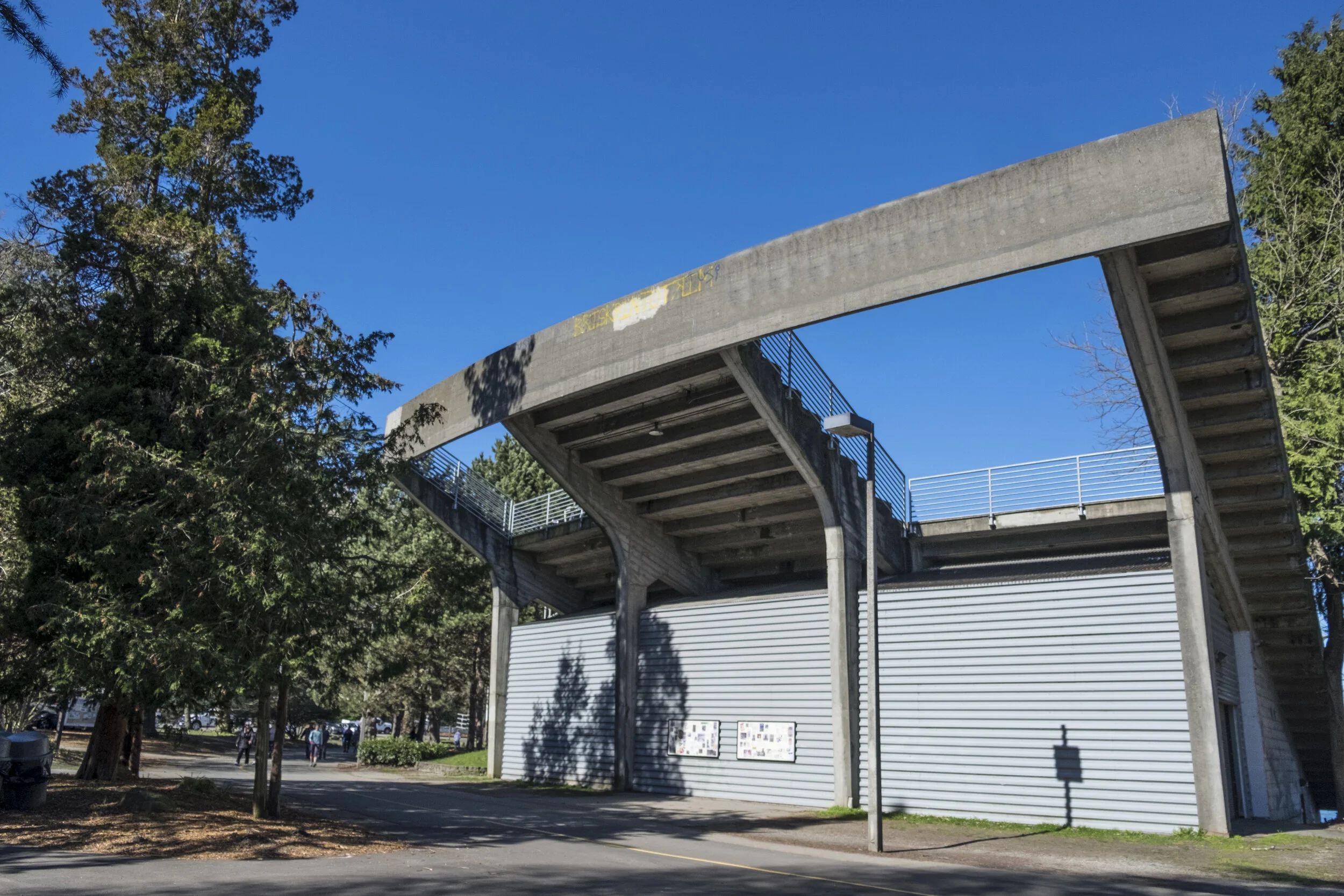
The Aqua Theater Mural
Another piece of this assignment was to think about decorating the Green Lake Aqua theater. I chose to make a mural, and I based it on all the previous drawings and patterns that I made. The design system that I initially created is limited but it turned out to be enough variety for creating a bigger piece including a lot of shapes and details.